Responsive Web Design
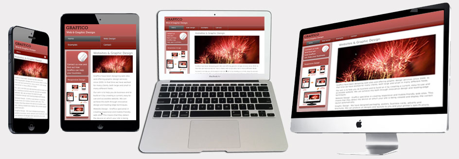
Over half the population of the UK use their mobile devices to browse the net, so in order for them to see your site at its best, it needs to be responsive. A responsive site is one that detects the type of device your site is being viewed on and automatically displays it in the most appropriate layout
We can create the simplest website through to more complex sites with forms, animation, sound and music.
How Responsive Works
Whichever device you are using, smartphone, tablet, laptop or desktop computer, the website will recognise it and display the layout designed for that device. It will also detect whether your smartphone or tablet is being used in portrait or landscape mode.
